This year, Pantone surprised everyone by announcing two colors for their 2016 Color of the Year! The chosen colors are the sweet pink Rose Quartz and the baby blue Serenity. Pantone chose these colors with the prediction that 2016 will see a large focus on calmness and meditation. These soft colors can look calming and reflective when used the right way and overpowering and tacky if used the wrong way. Follow our tips to make sure that you are utilizing Pantone’s 2016 Color of the Year in the most complimentary way possible.
Accents and Subtle Lighting
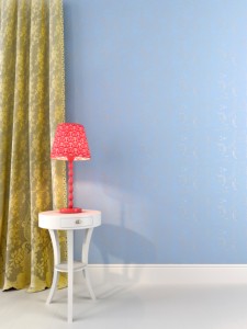
The whole idea behind Pantone’s 2016 Color of the Year is to convey calmness and, well, serenity. Painting a room entirely in these two colors, or even one of these two colors, may turn out a bit overwhelming. We can easily see wallcoverings with blue and pink patterns as looking tacky and dated. To use Pantone’s 2016 Color of the Year in a way that looks updated and modern, try instead painting a single accent wall. For an even subtler touch, try painting the wall in a soft gradient. Add some lighting of the opposite color to create a complete, dynamic effect. An accent wall painted in a soft Serenity gradient paired with the light from a Rose Quartz lamp would look delicate and sweet.
Window Treatments
You can also incorporate Pantone’s 2016 Color of the Year into your home by utilizing colored window treatments. Rose Quartz curtains with Serenity curtain linings would look subtle and charming. With two colors, the best route is to choose one predominant color and have the other as an accent color. If you have simple curtains without linings, consider Serenity blue curtains or valances with a soft, subtle floral design or pinstripes. Just remember to stick with whichever color you choose to be the dominant color throughout your home. So, if you do go with a Serenity blue accent wall, don’t choose Rose Quartz pink curtains. Match Serenity blue curtains with Rose Quartz accents to the Serenity blue wall with Rose Quartz lighting. Consistency is key to making your home look inviting and aesthetically pleasing!
Get In Touch With Columbia Paint Company Today
Do you need some great Benjamin Moore paint to get started on your painting projects in Howard County this fall? Columbia Paint Company is your one-stop shop for all of your home-decorating needs. From fabulous Hunter Douglass window treatments to beautiful Benjamin Moore paint products, we have everything you need to make your dream home design a reality. Schedule an appointment with one of our design consultants today!
Don’t forget to check us out on Facebook, Twitter, Pinterest, and Google+ for more updates, information, and tips!


